Three-phase home energy data gets confusing because it shows several truths at once. The total import or export number tells you what the whole site is doing overall, while each phase can still be behaving differently underneath. If you remember that totals answer the billing question and phase-by-phase numbers answer the troubleshooting question, most of the confusion disappears.
Start with the total before you look at each phase
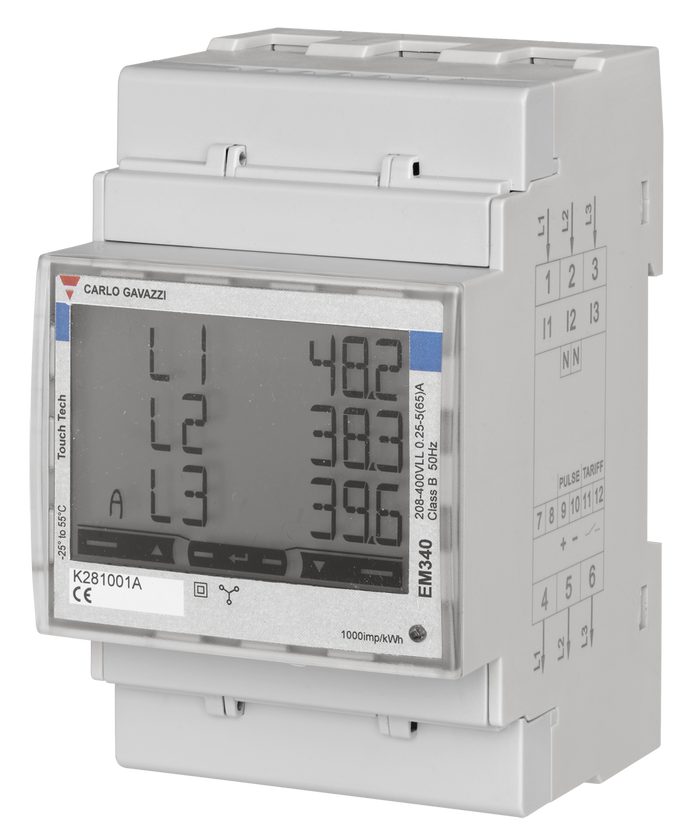
If your meter, inverter, or monitoring platform shows L1, L2, and L3 separately, it is tempting to study those first. In practice, start with the total site figure.
The total tells you the fastest answer to the most important question:
- Is the house importing from the grid overall?
- Is it exporting overall?
- Is solar mostly covering the load?
- Is the battery or inverter helping in the way you expected?
Phase-level numbers matter, but they are usually a second-step diagnostic layer.
| What you are looking at | Best use | Why it matters |
|---|---|---|
| Total grid import or export | Understand net site behavior | This is usually closest to the billing and settlement view |
| Per-phase power | Spot imbalance or unusual loading | Shows whether one phase is carrying more than the others |
| Per-phase energy over time | Find recurring problems | Useful when the same phase keeps importing heavily |
| Voltage, current, and power factor | Diagnose electrical behavior | Helps explain why a phase looks odd even when total kWh seems reasonable |
Know the difference between power and energy
Many readers get lost because dashboards mix instantaneous power and accumulated energy on the same screen.
- Power is what is happening now, usually shown in W or kW.
- Energy is what happened over time, usually shown in kWh.
A phase that shows 2.1 kW import right now is not the same thing as a phase that accumulated 12 kWh import today. One is a snapshot. The other is a running total.
If your screen looks chaotic, check the unit first before you decide the system is wrong.
In a three-phase home, one phase can import while another exports
This is one of the most common points of confusion.
A solar or hybrid setup can leave you importing on one phase while exporting on another at the same moment. That does not automatically mean the meter is broken. It often means your loads and generation are unevenly distributed across the phases.
For example:
- the oven and ducted system may be pulling harder on one phase
- the EV charger may sit mostly on another phase
- the inverter may be coupled in a way that does not balance each phase equally
- one phase may simply have more daytime household load than the others
So if L1 imports 0.8 kW, L2 exports 0.4 kW, and L3 exports 0.7 kW, the whole site may still be a net exporter overall. The total matters first. The phase detail explains why the total looks the way it does.
Read totals for decisions and phases for diagnosis
A simple rule helps:
- Use totals when deciding whether the home is self-consuming well, importing too much, or exporting more than expected.
- Use phases when trying to understand why that is happening.
This matters especially if you are checking:
- whether solar is offsetting the house properly
- whether a battery is reducing grid reliance
- whether an EV charger is pushing one phase too hard
- whether a hot water circuit or ducted system is skewing the load
If you jump straight into per-phase charts, you can spend a long time analyzing noise before answering the bigger site-level question.
Your measurement point changes the meaning of the numbers
Not all dashboards are measuring at the same place.
A utility smart meter, a DIN-rail three-phase meter, an inverter app, and a branch-circuit monitor can all be accurate while still showing different numbers. They may be measuring different parts of the system.
A practical way to think about it:
- The utility meter tells you what crossed the grid boundary.
- A main three-phase meter usually tells you what the site imported or exported at the main supply point.
- An inverter app mainly tells you what the solar inverter is doing, not everything the house is doing.
- A circuit meter tells you what one branch or load is doing, not the whole property.
That is why related EnergyMeterHub guides such as Smart Meter vs Inverter Meter vs Clamp Monitor, How to Add Consumption Monitoring to a Solar Home That Only Has Inverter Data, and Main Meter vs Circuit Meter for Solar Homes often need to be read together.
What phase imbalance usually looks like in real life
You do not need perfectly equal numbers on L1, L2, and L3.
In real homes, three-phase data often looks uneven because:
- large loads are not distributed perfectly across the board
- some appliances are single-phase even in a three-phase property
- solar and battery equipment may not offset each phase in the same way
- load timing changes minute by minute
What matters is whether the imbalance is understandable and consistent with the installation.
A normal-looking pattern usually has these traits:
- total import and export direction makes sense
- one phase may run higher, but not in a way that defies the connected loads
- daily and weekly patterns are reasonably repeatable
- the numbers align broadly with what turns on in the house
A suspicious pattern usually looks like this:
- one phase is always negative or always zero when it should not be
- totals do not broadly line up with utility or inverter trends
- phase behavior flips in an impossible-looking way after installation
- turning a large known load on does not affect the expected phase
When the numbers are probably wrong
Three-phase monitoring becomes genuinely misleading when the installation or configuration is wrong.
Check these first:
| Symptom | Likely cause | What to check |
|---|---|---|
| One phase always reads backward | CT direction or meter polarity issue | Verify arrow direction and terminal orientation |
| Solar appears to increase household load | Measurement point or sign convention is wrong | Confirm whether the meter is at the grid boundary or inverter boundary |
| Per-phase totals look unrealistic | Wrong phase mapping | Check that L1, L2, and L3 voltage and CT channels match |
| Whole-site total feels believable but phase detail looks bizarre | Mixed measurement sources | Confirm whether the dashboard is combining utility, inverter, and clamp data |
| A large appliance does not move the expected phase | Circuit assumption is wrong | Trace which phase actually feeds that load |
If CTs are involved anywhere in the chain, it is also worth reviewing How to Avoid CT Clamp Placement Mistakes in Home Energy Monitoring.
When a three-phase meter is worth the extra effort
A proper three-phase meter becomes more valuable when you need answers that a simple inverter app or single-point clamp monitor cannot provide.
It is especially useful if you want to:
- see per-phase import and export clearly
- understand whether a battery or inverter is behaving sensibly across the site
- monitor a three-phase EV charger or workshop load
- validate whether phase imbalance is a real issue or just a visual distraction
- feed cleaner data into Home Assistant or another local monitoring platform
On EnergyMeterHub, device pages such as IAMMETER WEM3080T, Chint DTSU666, and Eastron SDM630 are relevant starting points if you are comparing three-phase monitoring hardware rather than just interpreting an existing dashboard.
A simple reading order that keeps you sane
When you open a three-phase dashboard, use this order:
- Check the total site import or export first.
- Check whether the view is power or energy.
- Check each phase only after the total makes sense.
- Compare phase behavior with known large loads.
- Confirm where the meter sits in the system.
- Only then decide whether the system is truly wrong.
That workflow avoids a lot of false alarms.
Bottom line
Three-phase home energy data only feels overwhelming when totals, phases, and measurement points get mixed together.
Start with the whole-site number, separate power from energy, and then use per-phase data as a diagnostic tool rather than the first thing you stare at. Once you do that, most confusing dashboards stop looking random and start telling a usable story.