PVOutput for Solar Monitoring
Yes, PVOutput belongs in Integrations.
In practice, it works as a cloud destination and analytics layer for solar data coming from inverters, meters, batteries, gateways, or custom upload scripts. It is not a hardware brand, and it is not a local automation platform. It sits above the hardware and gives homeowners a place to log, compare, graph, and share system performance.
PVOutput has been around for a long time, and that still matters. A lot of newer solar apps are polished, but they are locked to one vendor. PVOutput is different: it is built around uploads, APIs, comparison, and public system data. If your goal is to compare your system against nearby sites, track both generation and consumption, or move data from one hardware stack to another without rebuilding everything, PVOutput still has a clear role.
What homeowners actually get from it
| What you want | What PVOutput adds | Why people still use it |
|---|---|---|
| Track solar generation over time | Daily, weekly, monthly, yearly, and live views | Easy to spot underperformance, shading changes, or inverter faults |
| See more than just inverter output | Consumption and net data can be uploaded alongside generation | Better for understanding self-consumption, imports, and exports |
| Compare against other systems | Public comparison with nearby or similar systems | Useful when the question is "is my system weak, or is the weather just bad?" |
| Keep hardware options open | Data can be uploaded manually, through the API, or through third-party connectors | Helpful when vendor apps are limited or your hardware changes later |
| Build your own workflow | Open API, batch uploads, alerting, and callbacks | Popular with DIY users who want scripts, gateways, or custom dashboards |
| Add regional context in Australia | Public supply-and-demand pages for Australian states | Gives a quick benchmark beyond your own roof |
Hard numbers worth knowing
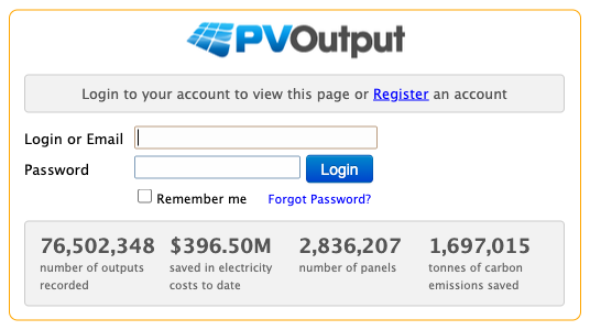
As of April 1, 2026, the public PVOutput homepage shows:
- 77,874,629 outputs recorded
- 2,864,401 panels
- 1.61 TWh produced
- 852.36 MW installed
- $403.20M saved in electricity costs
- 1,725,712 tonnes of carbon emissions saved
Those numbers change over time, but they give a fair sense of scale: PVOutput is not a toy dashboard with a tiny user base.
The homepage screenshot below is useful because it shows the service exactly as many first-time users see it: not as a polished inverter app, but as a long-running solar data platform built around uploads, comparisons, and public performance stats.
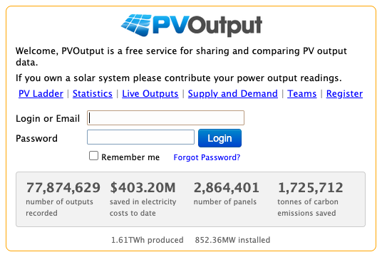
PVOutput homepage on April 1, 2026, showing public fleet counters and entry points into live views and system dashboards.
Current platform details that matter before you commit
| Item | Current documented detail | Why it matters |
|---|---|---|
| Live data interval | 5 minutes by default, with 10-minute and 15-minute options | Good enough for meaningful solar tracking without massive data overhead |
| Donation threshold | AUD 15 or more for 1 year | Important because several useful features sit behind donation mode |
| API rate limit | 60 requests/hour standard, 300 requests/hour with donation | Relevant if you upload from a gateway, script, or custom collector |
| Batch live upload size | 30 standard, 100 with donation | Helps when backfilling or buffering data |
| Live backload window | 14 days standard, 90 days with donation | Useful if your logger was offline and you want to recover data |
| Extended live channels | Extra streams via v7 to v12 in donation mode | Handy for battery, temperature, voltage, or custom metrics |
| Multi-system support | Up to 10 systems per account in donation mode | Useful for installers, hobbyists, or users with multiple sites |
Australia is one of the more interesting use cases
PVOutput is not just a private system diary. For Australian users, one of the more useful public views is the regional supply-and-demand page, which aggregates participating systems by state or territory.
On April 1, 2026 at the public snapshot shown for Queensland, PVOutput listed the following Australian regional totals:
| Region | Public total size | Public generation snapshot |
|---|---|---|
| Queensland | 7.763 MW | 2.861 MW |
| New South Wales | 3.583 MW | 1.514 MW |
| Victoria | 3.618 MW | 759.970 kW |
| Western Australia | 2.006 MW | 1.080 MW |
| South Australia | 1.629 MW | 830.263 kW |
| Australian Capital Territory | 826.330 kW | 396.225 kW |
| Northern Territory | 82.710 kW | 42.695 kW |
| Tasmania | 289.664 kW | 33.935 kW |
That public state view will not replace your own meter or inverter app, but it is useful context. If your system is weak while a broader regional sample is strong, you know to look closer at your hardware, array orientation, shading, or uploader setup.
Public Queensland supply-and-demand view captured from PVOutput on April 1, 2026. This is one of the more practical reasons Australian users still care about the platform.
Compatibility is broader than many people expect
PVOutput documents several upload paths:
- its own API
- an older PVOutput Integration Service
- a large contributed software ecosystem
- vendor-specific connectors and scripts built by the community
The official service integration documentation still lists formats such as Tesla Powerwall, Growatt ShineNET, Enphase API / Envoy, Solar-Log, Sunny Roo TL Monitoring, Aurora Communicator, and Current Cost. The contributed software list is even broader, with examples covering SMA, GoodWe, Sungrow, SAJ, IoTaWatt, Eastron SDM630, Powerwall, and several Raspberry Pi based uploaders.
That is the main reason PVOutput still turns up in serious homeowner and installer discussions. It can act as a neutral destination when the hardware on site is mixed, older, or no longer well supported by the original vendor portal.
PVOutput also supports public system photos. That sounds minor, but it helps when you are comparing real-world installations rather than anonymous data points on a chart.
The live dashboard is where PVOutput feels most different from a simple monthly generation portal. You can quickly tell whether a site is flatlining, clipping, ramping up normally, or drifting below expectations.
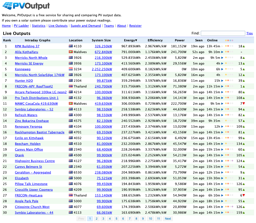
PVOutput live view with real-time power, energy, and chart history. It is not the newest interface on the market, but the data density is still useful.
Best fit
PVOutput makes the most sense if you want:
- a cloud service that is not tied to a single inverter brand
- public benchmarking against nearby systems
- both generation and consumption history in one place
- API-friendly uploads from scripts, gateways, or custom hardware
- a second opinion beyond the default inverter app
Watchouts
There are tradeoffs.
- The interface is useful, but it looks dated compared with newer consumer apps.
- Setup quality depends heavily on the uploader or script you use.
- Some of the better workflow features sit behind the donation tier.
- If you only want a polished plug-and-play app from one inverter brand, the native vendor portal may feel easier.
Bottom line
PVOutput is a real integration, and a useful one.
It is best thought of as a cloud monitoring and comparison service for people who care more about data flexibility than vendor polish. If your current inverter app shows only your own site and gives you no clean way to compare, export, or automate, PVOutput can still solve a real problem in 2026.